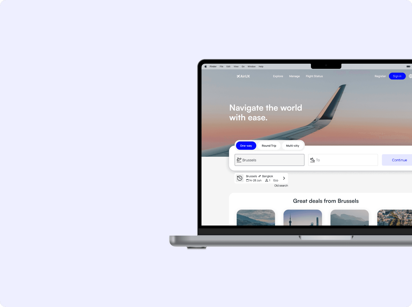
AirUX: Rethinking the flight Booking experience
A user-centered redesign that addresses common frustrations in airline booking flows, aiming to make the experience smoother, simpler, and more intuitive.
Role
UX designer
Tools
Figma, Miro
Timeline
Febuary 2025-July 2025
Overview
AirUX is a UX case study I developed during my certification with the UX Design Institute. The brief was simple: create a better airline booking experience that feels clear, fast, and user-friendly from beginning to end.
Many airline websites overwhelm users with cluttered layouts, unexpected fees, and confusing steps. My goal was to simplify the journey, remove unnecessary friction, and help users feel more confident and in control while booking their flights.
What I learned
To understand where booking flows go wrong, I approached the problem from three angles: competitor analysis, direct user observation, and survey feedback. This triangulated approach allowed me to spot overlapping patterns and build a clearer, more reliable foundation for design decisions.
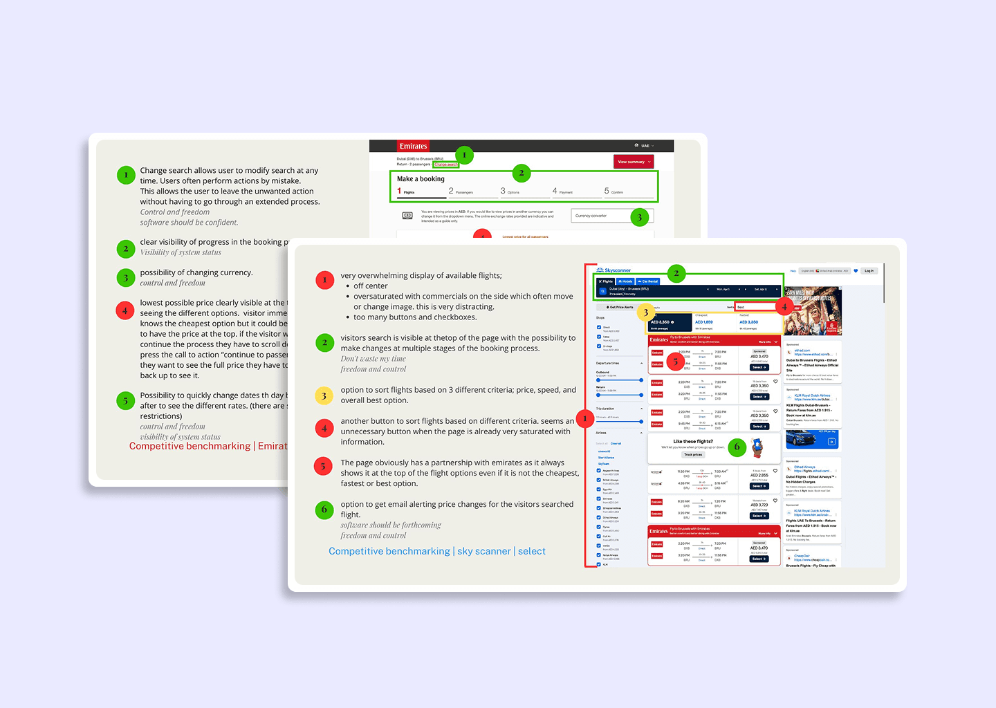
🗂️ Competitive Benchmarking
I reviewed the booking experiences of major airlines to identify usability patterns.
→ Insight: Most airline websites overwhelm users early in the booking process with visual clutter, constant upsell prompts, and unclear pricing
What I saw
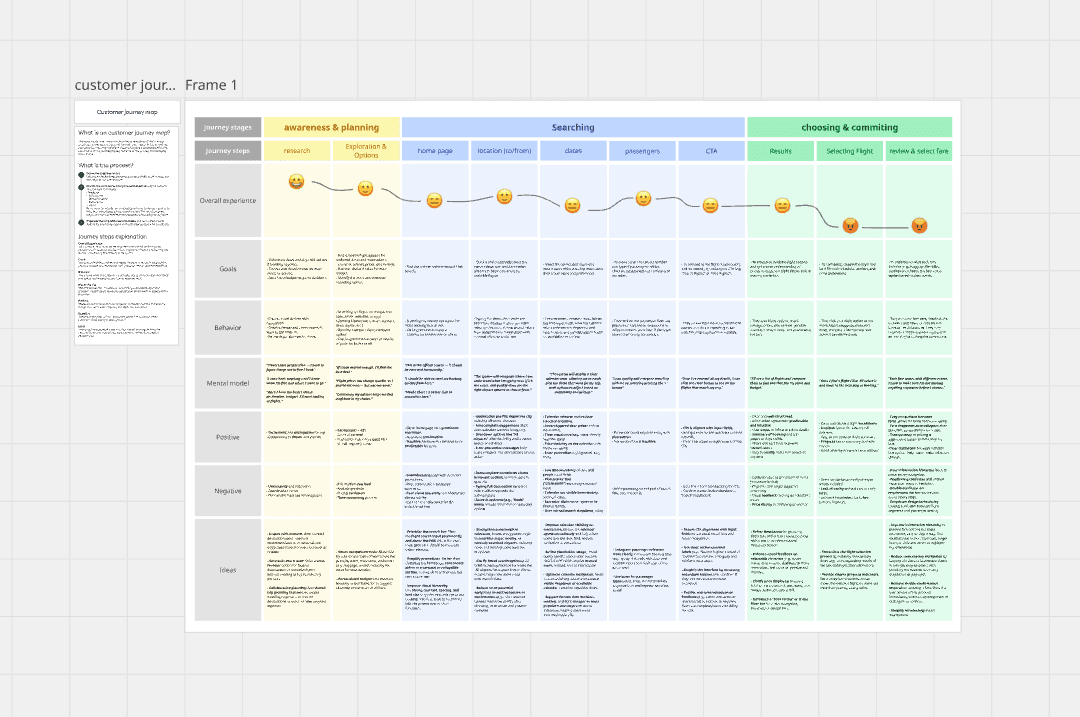
After gathering research, I translated raw feedback into clear patterns and opportunities using two analysis tools: an affinity and a customer journey map. This helped me spot where users were getting stuck and why.
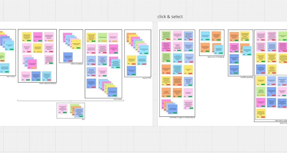
🔍 Affinity Diagram
Key Patterns I Mapped
Pricing clues were buried or inconsistent, so users couldn’t trust the total.
Visual clutter (ads, upsells) pulled attention away from the main flow.
Labels and buttons didn’t match travelers’ mental models, slowing them down.
✈️ Customer Journey Map
Journey Pain Points
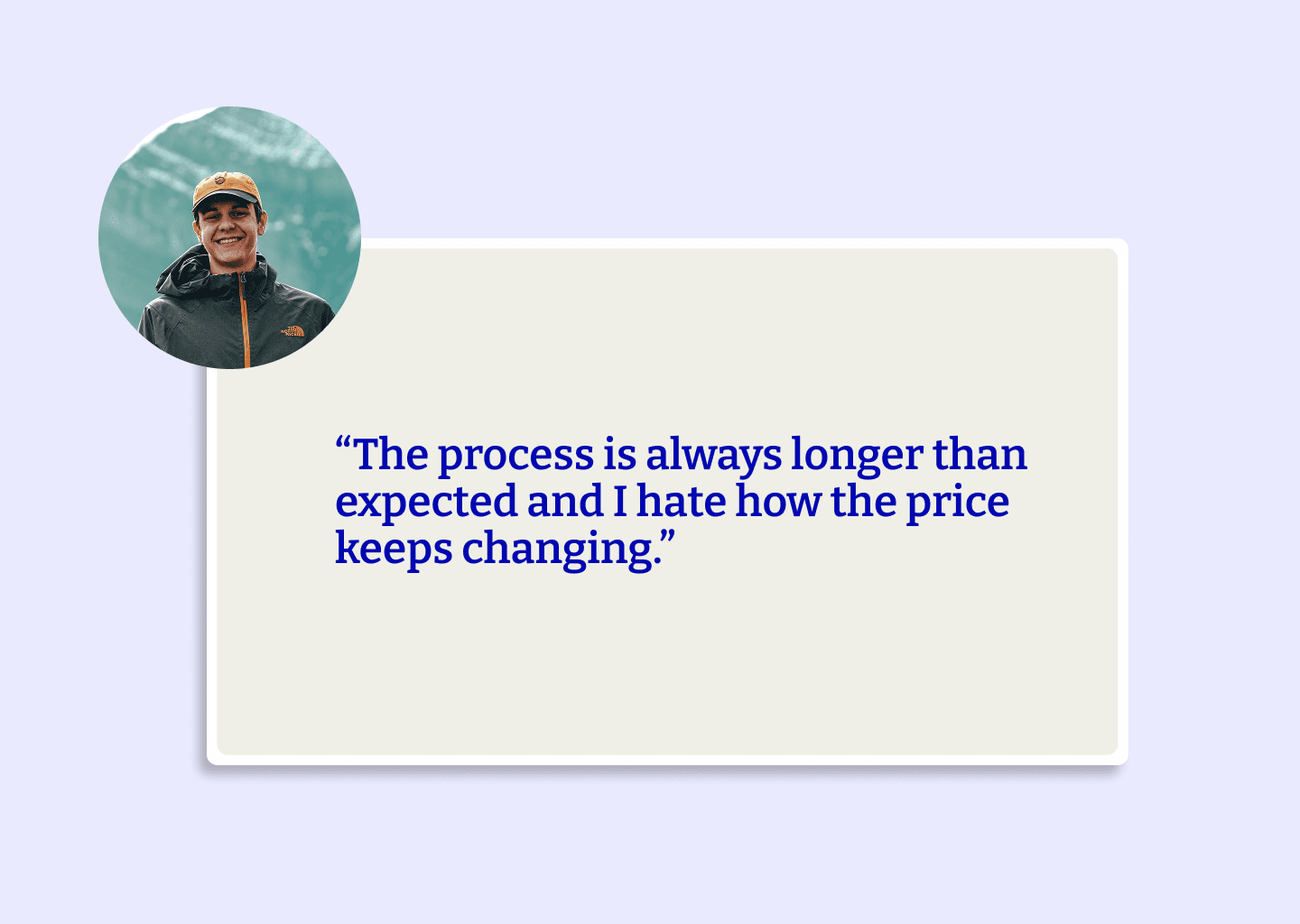
Confidence dipped at checkout (hidden fees, unexpected extras).
Seat-selection felt like a maze—people weren’t sure what was required vs. optional.
The overall flow had unnecessary detours that made quick booking impossible.
Solution: turning insight into a smoother flow
Why this flow?
Every fix ties back to the pain-points you saw: hidden costs, distracting pages, unclear next steps. The redesigned journey keeps users on a single, predictable track from Search → Results → Details → Extras → Pay, with cost certainty and one primary action per screen.
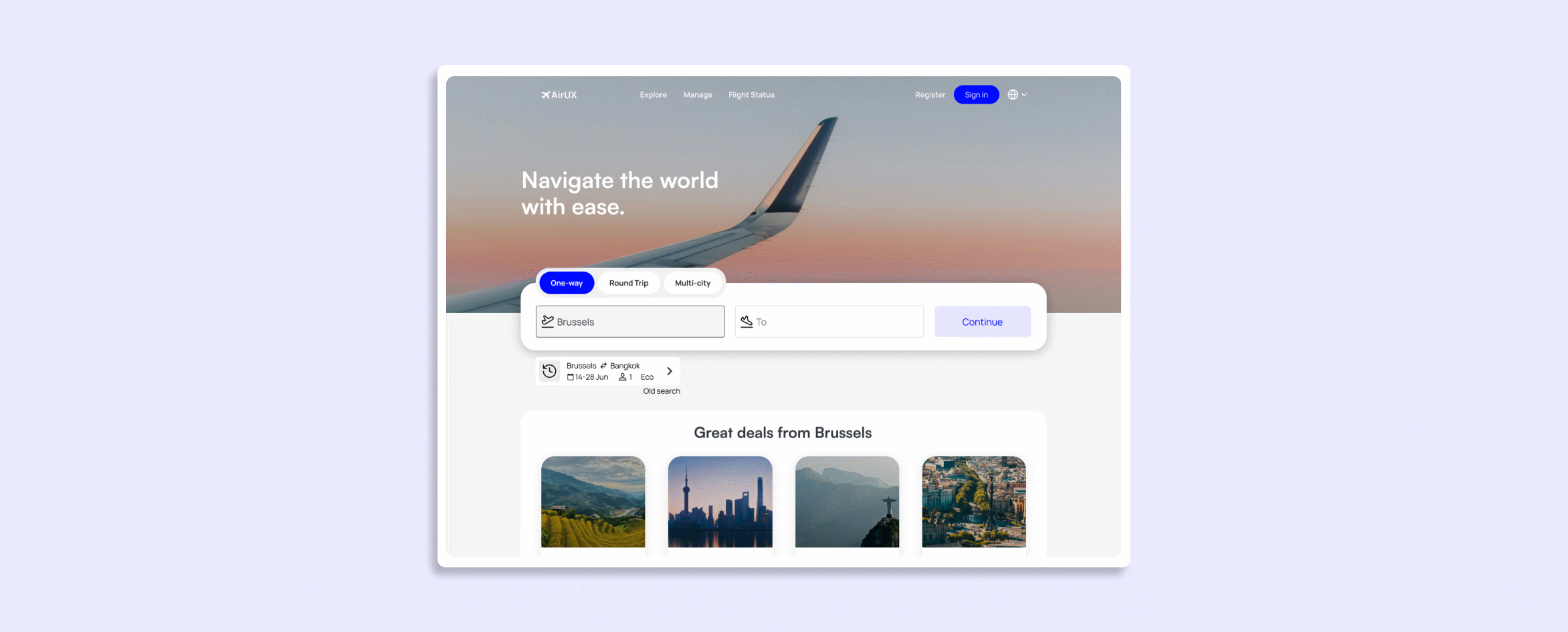
1. Search –> Results
Problem: Users felt overwhelmed by multi-field forms and often missed the call-to-action button.
Design Solution:
Introduced progressive input fields that open one at a time
Added a sticky CTA to keep the next step always visible
Enabled auto-detect for the departure location to reduce manual input.
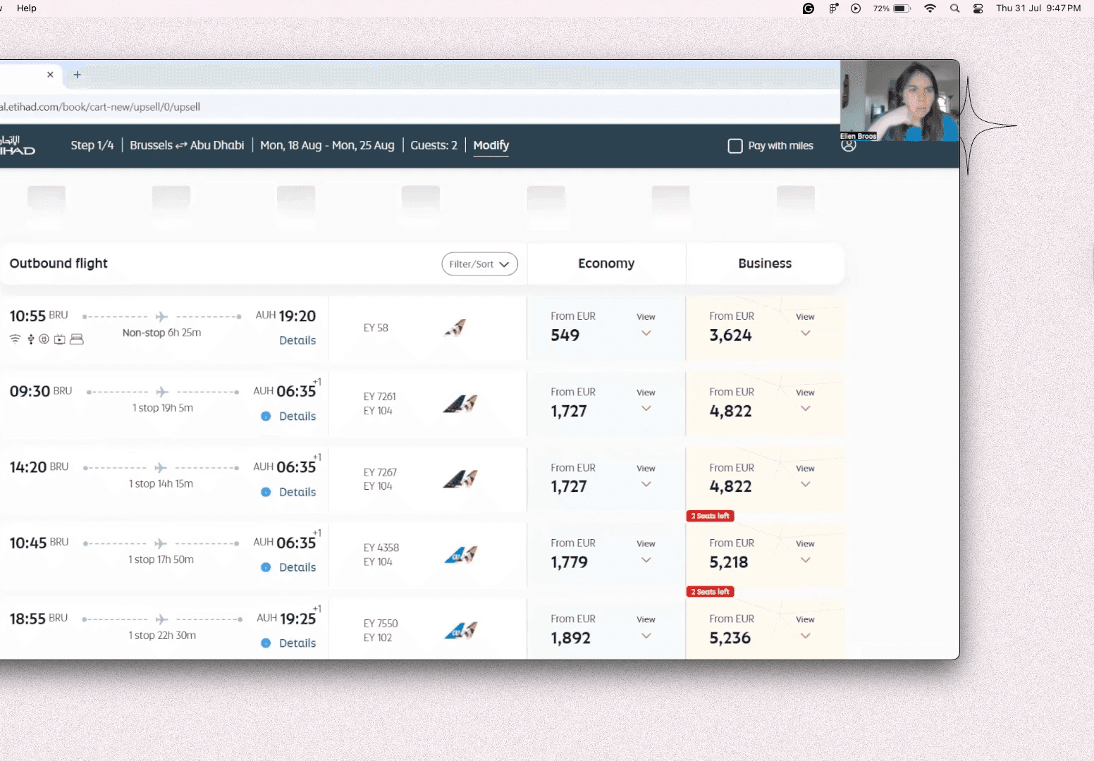
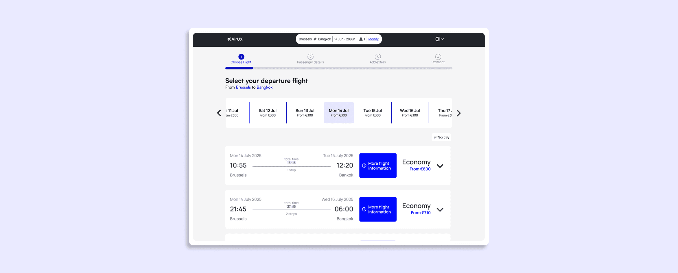
2. Results clarity
Problem: Users struggled with dense tables, hidden fees, and unclear layover information.
Design Solution:
Replaced tables with a single-column card layout for better readability
Displayed total price clearly on each card to avoid surprises
Added an “i” tooltip for layover details to improve transparency without clutter
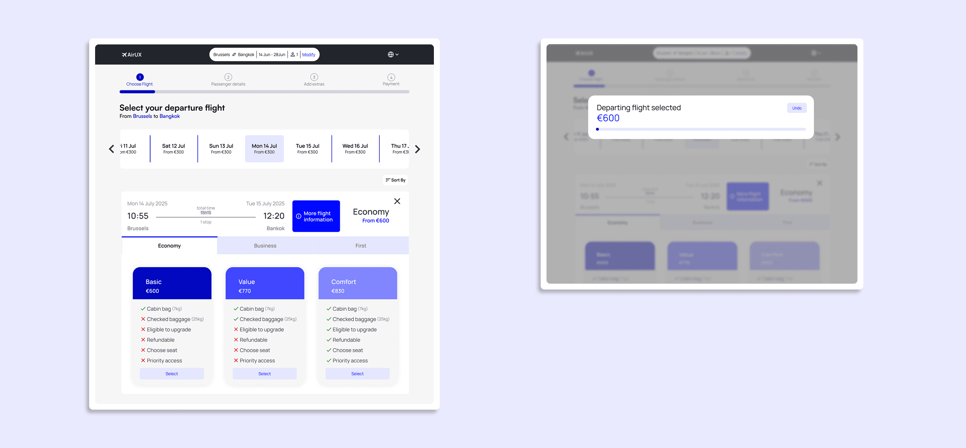
3. Ticket & seat decision
Problem: Fare bundles and industry jargon left users confused and unsure about what they were choosing.
Design Solution:
Introduced plain-language fare options (“Basic,” “Standard,” “Flex”)
Added a one-line summary of key perks under each option
Displayed a real-time total to help users confidently compare and choose a tier
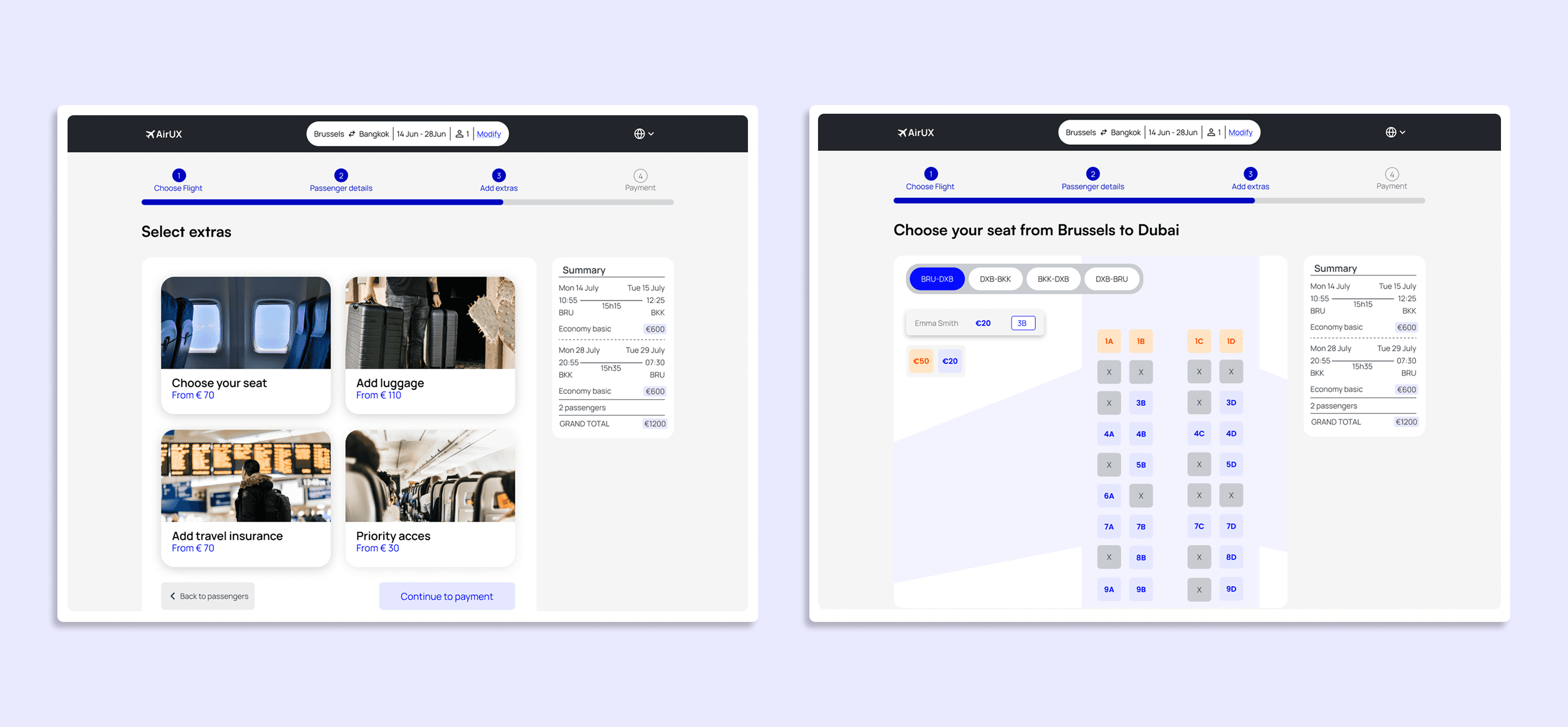
4. Seat selection
Problem: When seats and add-ons were spread across multiple pages, travelers felt rushed, missed important options, and were often surprised by extra fees at the end.
Design Solution:
Combined seat selection and extras into one clear, dedicated step
Kept the total price visible at all times on the right side of the page
Made it easy to review and adjust add-ons without losing track of costs
Try the prototype
Final Thoughts
This project taught me how powerful small UX decisions can be when they’re grounded in real user insight. By breaking down the booking process and simplifying each step, I was able to design a flow that feels more transparent, less stressful, and easier to complete.
Working on AirUX helped me grow not only as a designer, but also as a problem-solver. I learned how to turn scattered feedback into clear direction, balance business goals with user needs, and stay focused on clarity above all.